TabStacker, a Chrome Browser Extension to Help Manage Multiple Tabs
Timeline
8 Weeks, Aug-Oct 2023 (Remote)
Team
Maria Dmitrieva | Manas Verma | Mudassir Khan
My Role
Product Designer
Methodologies
User Research & Synthesis, Survey, Sketching, Wireframing, Prototyping, Iterative Design, Visual Design, Usability Testing
Tools
Figma, Google Forms, Google Hangouts
Overview
TabStacker is a Chrome browser extension to help people manage multiple tabs.
Having many tabs open at once clutters our mind and makes us less productive. We wanted to make a Chrome extension to help people be more productive in their workflow in surfing the web whether it’s for work, school, or personal hobbies, etc.
This was a team project done as part of Co.Lab’s Product Bootcamp where I collaborated with a product manager and two developers on building the MVP for our product.

Research
We wanted to find out the actual problems that users were currently facing.
We used Google Forms to survey 49 respondents. We were surprised to learn that users didn’t have as many tabs open as we originally thought.
Given the timeframe of the project and our varying timezones, we opted to do research using a survey. I learned to keep questions short in a survey to ensure completion rate, asking only essential questions.
Synthesize Data
There were two personas that emerged from our user research:
A Google Chrome user who spends on average 5-8 hours on the computer every day. He/she has 1-10 tabs open and feels that it doesn’t affect their productivity level. However, the user doesn’t mind trying a new tool if it has good features and is easy to use.
A Google Chrome user who spends on average 9-12 hours on the computer; has more than 10 tabs open and is struggling with productivity. The user needs a tool to manage tabs.
User Story
Primary Actions:
As a user, I want this tab manager to be easy to use.
As a user, I want to group tabs.
Design
Based on what was discovered during user research, one of the core features is the ability to group tabs.
When it came to the design, the concept I wanted to express was modern, futuristic, with lots of space and air.

Design System
To keep the product consistent, I made a small design system.
The typography and colors selected fit into the concept I wanted to portray. Using an 8px system helps keep things consistent and visually ordered.

Wireframes
To quickly ideate, I started with wireframes.
I shared with my team the low-fidelity designs for key features in this product such as grouping tabs, navigating to a tab, and the ability to delete a tab from the browser extension.

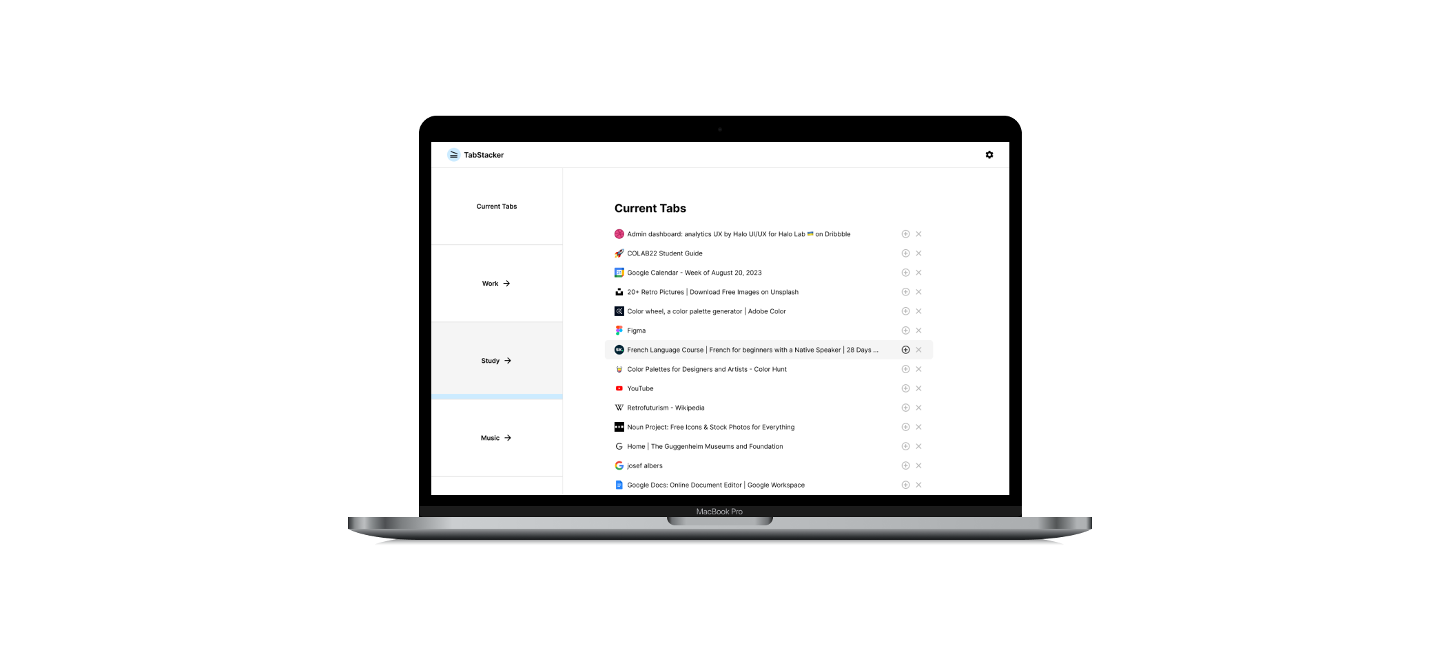
High-Fidelity Designs


Usability Testing
& Iterations
We gathered feedback on our designs from testing with users and iterated on the designs.
We usability tested with 3 users to see if they were able to easily group tabs into different folders. It was not as intuitive to group the tabs with the additional steps of first selecting the folder before adding tabs to it.
Originally, the idea was to be able to drag the tabs directly into different folders. However, due to the timeline of the project, the feasibility of this feature was not implemented on the coding side. This was an 8-week long project to build the MVP so we had to move quickly. However, they completed the other tasks like navigating to a tab and deleting a tab easily.
Based on this feedback, I iterated a new version for the Instructions page for users to be able to digest each step fully before reading the proceeding steps rather than presenting all of the directions at once. This way, users can fully understand how to use the current state of the product. It is more simplified and doesn’t overwhelm the user with so much text at once.
We would like to test with more users to see repeating feedback to make improvements to our product.

Additional Pages
New pages were created to visualize new features for our product.
There were new features and ideas that our team would like to develop in the future so I created new pages to visualize how they would look.


Learnings
Overall, I had a lot of fun with this project especially when it came to coming up with the concept for the design of this product. It was fun to come up with ideas, look at inspiration, and visualize how the interface would come to life. Furthermore, I learned the importance of sharing designs with the developers earlier to get their feedback on the feasibility of features in order to save time. I also learned to brush up on my usability testing skills and create a small design system to keep the product consistent.